UX RESEARCH | DESIGN
Plug.dj is a platform for music listening communities. They host chatrooms with a crowd sourced playlist feature. I worked with a team of UX designers to redesign and optimize the site for new users.


Plug.dj is a platform for music listening communities. They host chatrooms with a crowd sourced playlist feature. I worked with a team of UX designers to redesign and optimize the site for new users.
Overview
Plug.dj hosts chatrooms with a crowd sourced video-playlist feature. Users choose songs off of youtube, then join the room waitlist to DJ. While the music videos play, users vote to skip or show appreciation for songs.
Plug.dj was an extremely popular site at one time, with over 4 million registered users. It ran out of funds and closed in 2015, then, after a year’s hiatus, was bought and re-launched, much to the joy of a small, intensely loyal fanbase.
The client came to us with a problem. Old users were thrilled to have their favorite site back online, but almost all of the new users (around 2,000 daily) were not returning. We were asked to investigate this problem, and design new UX to help solve it.

Redesigned browsing page

Redesigned chatroom
Goals
To optimize the site for new users, we had three general goals for our design process.


It was also necessary to evaluate any major pain points that exist on the site and see if we could solve them. We dove into our research with these questions in mind. What is the value of the site? What do we want our new users to do so they will understand the site value?
Research
We conducted usability testing, an in depth heuristic evaluation, competitor research, interviews, and surveyed over 140 plug.dj users, including 25 new users. One nice thing about doing ux for a chatroom based website is that it's easy to reach out to users. In addition to our more structured research, we chatted daily with users on the site throughout our design process, building up an understanding of who plug.dj users are, and why they use the site.
From our research we pulled 3 main insights.

We found that users come to plug.dj for many different reasons. Some use it to control the music playlist in their offices, while others use it to share music with a de-centralized group of friends as the play online games. We documented 8 distinct use cases, and there are surely more.
The one thing that ties all the use cases together is the human music-curation feature, and for many users it is essential.

It's no surprise that new users are easily confused, but we discovered that the group music curation aspect of plug.dj is especially difficult for brand new users to grasp.
This came up again and again as testers failed to complete even simple tasks in our usability tests. This insight led us to put an emphasis on developing a clean interface with limited functionality so new users wouldn't get lost.
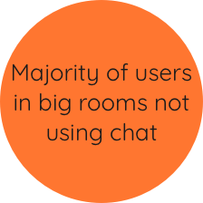
While it is great that plug.dj has many users in chatrooms willing to talk to us while we conducted research, we observed that the majority of the users in the popular rooms didn't seem to use the chat feature at all. In a room of 300 people, generally around 12-15 people are using the chat.
This insight told us that, while making friends and hanging out is important for some users, the vast majority of plug.dj users are probably only there to listen to music and play songs for others. It's unlikely that most are even looking at the screen.
Guided by these insights, we focused our re-design on 3 key problem areas of the current website.

Plug.dj has clickable elements running along the top and bottom of the screen, and in all four corners. In our testing we found that new users would get lost as soon as they got through sign-up. With too many things to click, they had no idea what to do.

There are no filters, and no browsing experience on plug.dj, so new users are on their own to find a room that matches their taste. Because the site doesn’t have tags (metadata) for rooms, the search terms our testers wanted to use were useless. This is not just an issue for new users. Active users of the site are limited in their enjoyment of plug.dj because they can’t find new rooms. Around 50% of the users we surveyed said they only visit two rooms or less on the site.

Current onboarding is positioned as a roadblock between the user and music listening. While the user goes through the messages, volume is set to zero and cannot be changed. It's also given to the user in one big lesson, so all steps must be read before the user can move on. Not surprisingly, it was being skipped without being read.
It’s best practice for onboarding to teach users features, not navigation/UI. This means it should be spaced out; messages should come up as users complete actions. Plug.dj's current onboarding is focused on explaining their overly complicated UI.
We developed onboarding that’s task focused and spread out over our newly created user flow.
WIRE-FRAMES AND USABILITY TESTING
We started usability testing on day one, and continued to test with the same script throughout our design process. This was important because we were attempting to reduce a complicated UI, and a lot of functionality, down to something a brand new user would be able to master on their first attempt.
When we had a user flow established, we began testing wireframe prototypes. We asked our testers to enter a room, vote to skip a song, then play a song for everyone. We worked through four different layouts to nail down a UI that could be intuitive for first time users.

We thought we'd put all the important UI below the most eye catching element, the youtube video. This was too cluttered for new users and failed as a layout.

Next we gave the DJing interaction its own menu in the chat area. Upon entering the room, messages start popping up, so the user's eyes are drawn here. This failed terribly. Too hidden for a primary interaction.

We thought we could clean up the interface by squishing the voting UI against the video, leaving space for the DJing UI to stand out. Testers did better, but some still got overwhelmed.
Every iteration helped us clean up the UI, and place elements in the areas users would most expect to find them. In the end we made and tested a full wire prototype of the site, complete with onboarding, to ensure that our layouts would be usable for users who had never been on the site.
Light & Dark
Plug.dj currently has a dark color theme that’s in-line with the EDM music scene. Dark color themes are good when users will be spending long hours on a site(look at netflix and spotify), because bright light tires your eyes. However, bright color themes are easier to look at at first, and can feel lighter and more inviting. Our client asked us to explore a light color theme that would be more welcoming to new users.
Plug.dj users spend ~2 hours on the site per session. To accommodate this behavior while optimizing the site for brand new users, we developed two color pallets: a light and a dark. New users default to the light theme, and can switch to the dark theme in their settings.

Plug.dj is trying to grow and become less niche, so we steered away from the EDM colors they have been using and developed a color palette drawn from 1970s music culture. We chose to align the plug.dj brand with a golden-age of human curated radio, emphasizing the human curation that is the core value of their product while making their image more universal.
Final

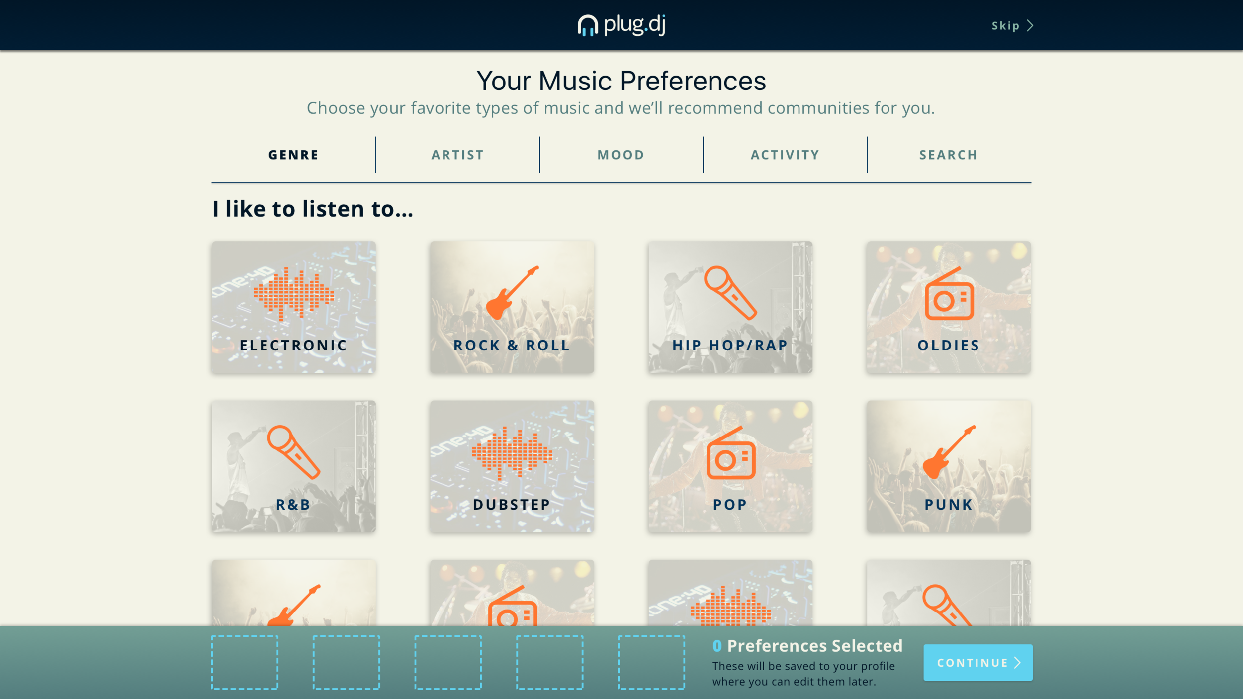
+ created a musical preferences page to help users with browsing.
+ users who skip section during sign up can edit it in their preferences.
+ helps users find rooms that interests them with minimal effort.

+ added announcement area to communicate special events and products.
+ created a category based browsing experience.
+ helps users find rooms that interests them with minimal effort and knowledge.
+ redesigned search results cards, losing unnecessary info and adding tags on hover. Helps users make the right choice from this page.

- reduced clickable elements from 17 to 9, to help new users focus on their primary task: visiting a room.
/ most UI consolidated into two menus.

- chatroom UI simplified to reduce cognitive load.
/ onboarding guides new user through tasks that demonstrate core value of plug.dj.
- removed dancing avatars from new user experience.
- removed the step of creating a playlist from new users’ flow.
Screens


The Team
This project was a collaboration between me, Zack Restifo, and Mary Buckingham, done pro-bono for plug.dj in 2017. The three of us were involved in all stages of the design process, but we each owned one particular area.


